Northampton Saints reveal new Club crest
- 3824
- Ultimate Rugby

Northampton Saints are proud to today reveal the Club’s new crest following months of research, engagement with supporters, and careful design work.
Produced in consultation with Jard Studio, the Club have drawn inspiration from our history in producing the new crest, going right back to our inception in 1880 and integrating the first emblem ever seen on a Saints kit within the new design.
Background
Over the past 12 months, the Club undertook imporant research including supporter surveys, engagement on matchdays, and analysis of engagement levels across the game to establish whether our current visual identity was suitable for a modern, professional sports organisation with high ambitions for the future.
Our research gave us some food for thought, indicating that our existing crest presented several significant challenges:
- DIFFICULT TO RECALL – even our most dedicated supporters could not remember key elements of a complicated and cluttered design.
- DOES NOT SHOWCASE SAINTS’ CORE COLOURS – three-quarters of our supporters told us that Black, Green and Gold is the most important part of the Club’s overall identity, yet these weren’t represented within our existing crest.
- HERITAGE – existing crest was only included on Saints’ playing kit since 1984, having been designed in the 1950s without any reference to the unique history of the Club itself, but rather as an adaptation of the Northampton coat of arms.
- AWARENESS – research indicates that awareness of Saints relative to other rugby clubs is low, with our existing visual identity not helping this.
- SCALE – in the modern age the Club’s crest will be seen online, digitally and on TV more than anywhere else. Indeed over 80% of visitors to the Saints website and 98% of users of the Club’s social media channels come from mobile devices. There is a need to make Club branding clearer and more legible in increasingly smaller spaces, but our existing version was almost impossible to scale, with all detail lost as you reduced its size.
With all that in mind, the Club set out to evolve and future-proof our crest – which a significant number of supporters indicated they would be open to within a series of online surveys.
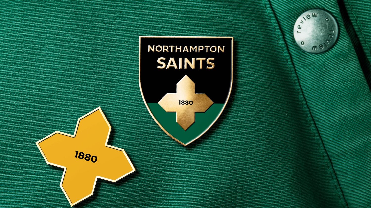
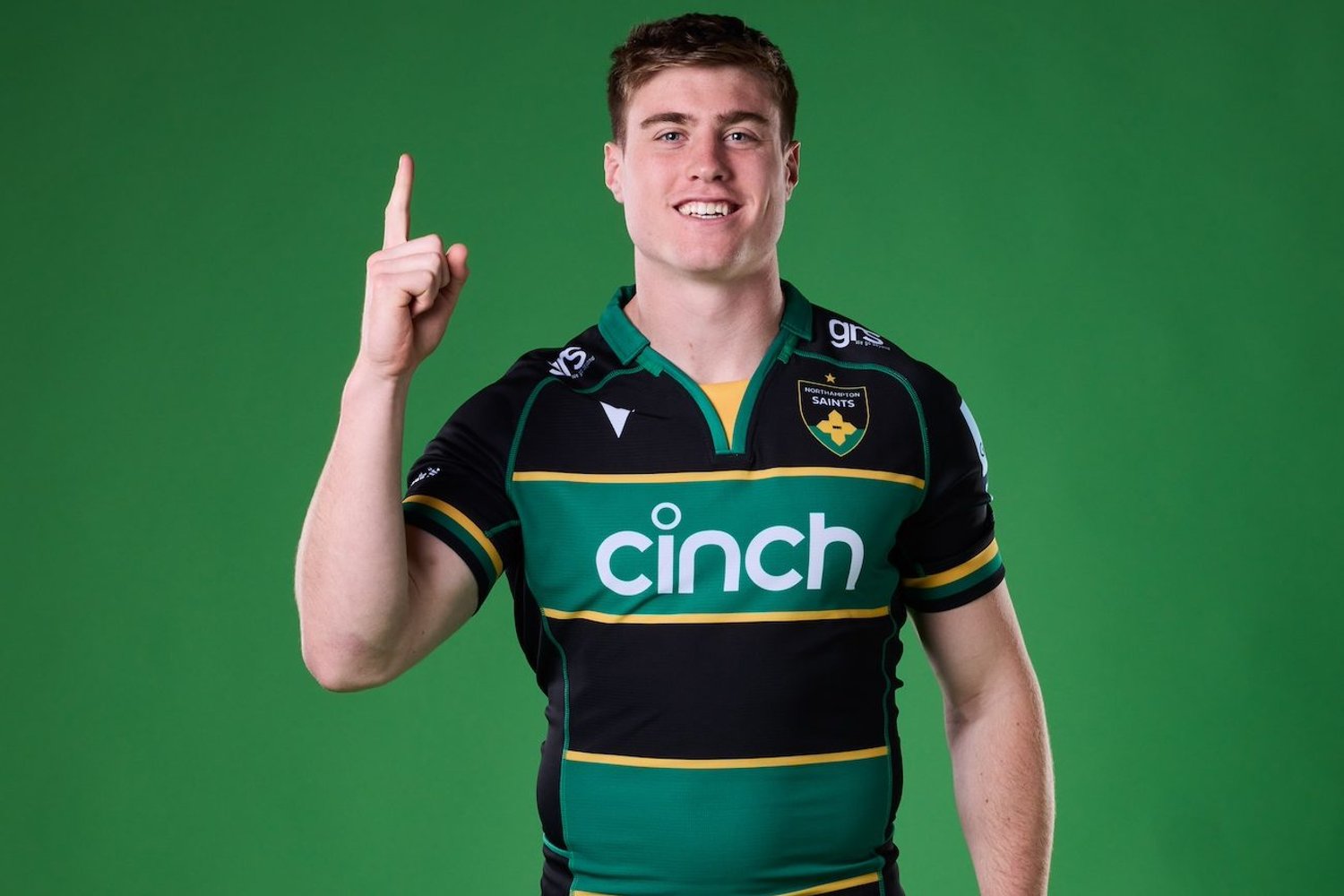
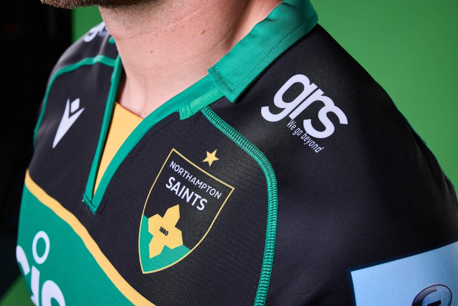
We are delighted to reveal the new crest which will be used immediately from the 2024/25 season onwards, and are confident all previous challenges have been resolved within the new, instantly recognisable and memorable design, which features our Black, Green and Gold colours and pays tribute to our inception as the Northampton St James Improvement Class back in 1880.
Message from Mark Darbon, Chief Executive
At Saints, we aim to be a modern, sustainable, and innovative rugby club which is at the heart of our community – but also a club which embraces and respects our unique history.
We are very proud of our past, but we always must look forwards. We are flying high at the moment as the new Champions of England, but we remain incredibly ambitious for the future and are confident our brightest days still lie ahead of us. I know our supporters share that spirit.
Earlier this year we identified that while many of the most popular and successful sports teams and organisations around the world have embraced change to produce clear visual identities, at Saints our own visual identity – in particular, our crest – could be stronger.
A significant number of people told us within our surveys that they would be open to change. We completely understand that change may be uncomfortable for some supporters who have had a long and powerful emotional relationship with our previous crest.
We believe that we must look forward to secure the continued relevance, appeal and sustainability of this brilliant Club.
So, we have evolved our crest to truly reflect the identity of Northampton Saints. Ensuring that we honoured the history and tradition of the Club, whilst looking ahead to the future, has been at the heart of all of our work – and we are grateful to our Club historian Graham McKechnie, the Heritage team at Northampton Saints Foundation, and Jard Studio for all their diligent research and support throughout the project.
Everyone at the Club is extremely excited about this new crest. As with anything new, we understand it will take some time to reflect on and get used to, but I very much hope that our fans too will support it, given its importance for the future of Northampton Saints.
Message from Graham McKechnie, Club Historian
This may be a new crest for Saints, but it’s very clearly something that is rooted within the Club’s history.
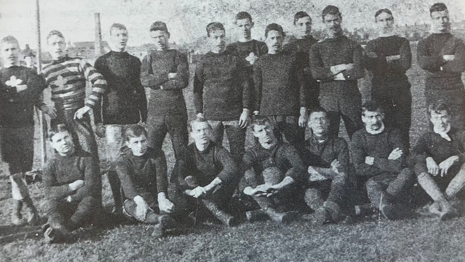
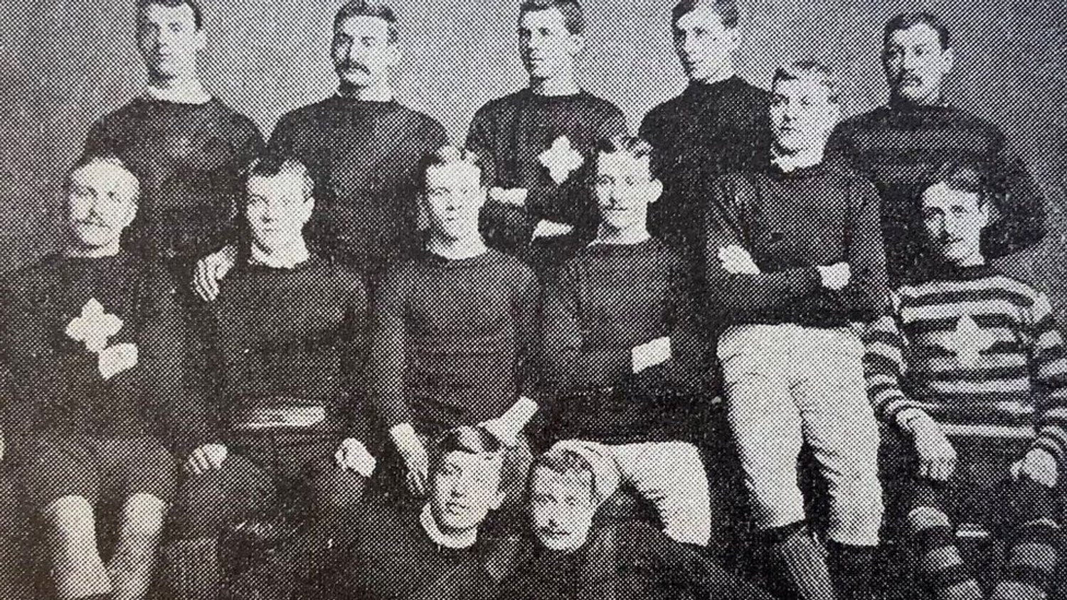
The earliest team photo we have was taken in 1884. Back then, they were called St James Improvement Class, playing at various fields around St James and on the Racecourse. On the front of some of their jerseys, you can see this emblem. We can’t be certain why they chose it, as no definitive explanation exists, but it’s very likely this is a link back to St James’ Church, with the emblem being a rough version of the St James Cross. Reverend Wigg himself mentions that his mother made crosses for the senior boys in the class to wear.
Of course, back then the jerseys were scarlet – the first captain, Jim Barker, tells us this. The Victorians weren’t afraid of change or innovation. The Club had several names in ‘St James Improvement Class’, ‘St James Britons’, and ‘Northampton St James’ before becoming ‘Northampton Saints’. The colours also changed from scarlet jerseys and black shorts, to green and black stripes in the 1890s, before they finally settled on Black, Green and Gold hoops in 1904.
I’m not sure what the boys of the Improvement Class, playing on a field in Jimmy’s End, would make of the modern Club and the professional game. But I think they’d like this – the emblem from their own jerseys 140 years ago returns, tying the visual identity of the Club to its unique history more closely than ever before. It’s a link back to these trailblazers, a nod to this Club’s extraordinary past, as well as looking ahead to the future.
Design
We have created a crest which honours Northampton Saints’ past, but also prepares us for the future.
We did not want to stray from our rich heritage and our unique identity. This was underpinned by our supporters, who cited within our research that they held several key elements close to their hearts – our history, our Black, Green and Gold colours, our name, and our shield.
Our new crest brings all of these together with a clean, elegant design which has taken direct inspiration from our history.
The result is designed to be memorable, impactful and instantly recognisable. The design has also inspired an all-new typography, called ‘Saintly’, which the Club will use across all digital and physical assets moving forwards.
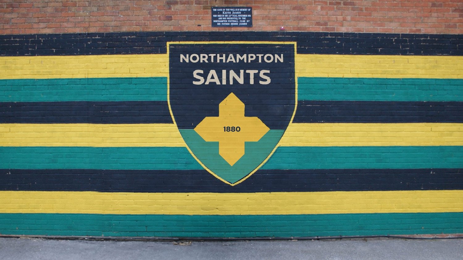
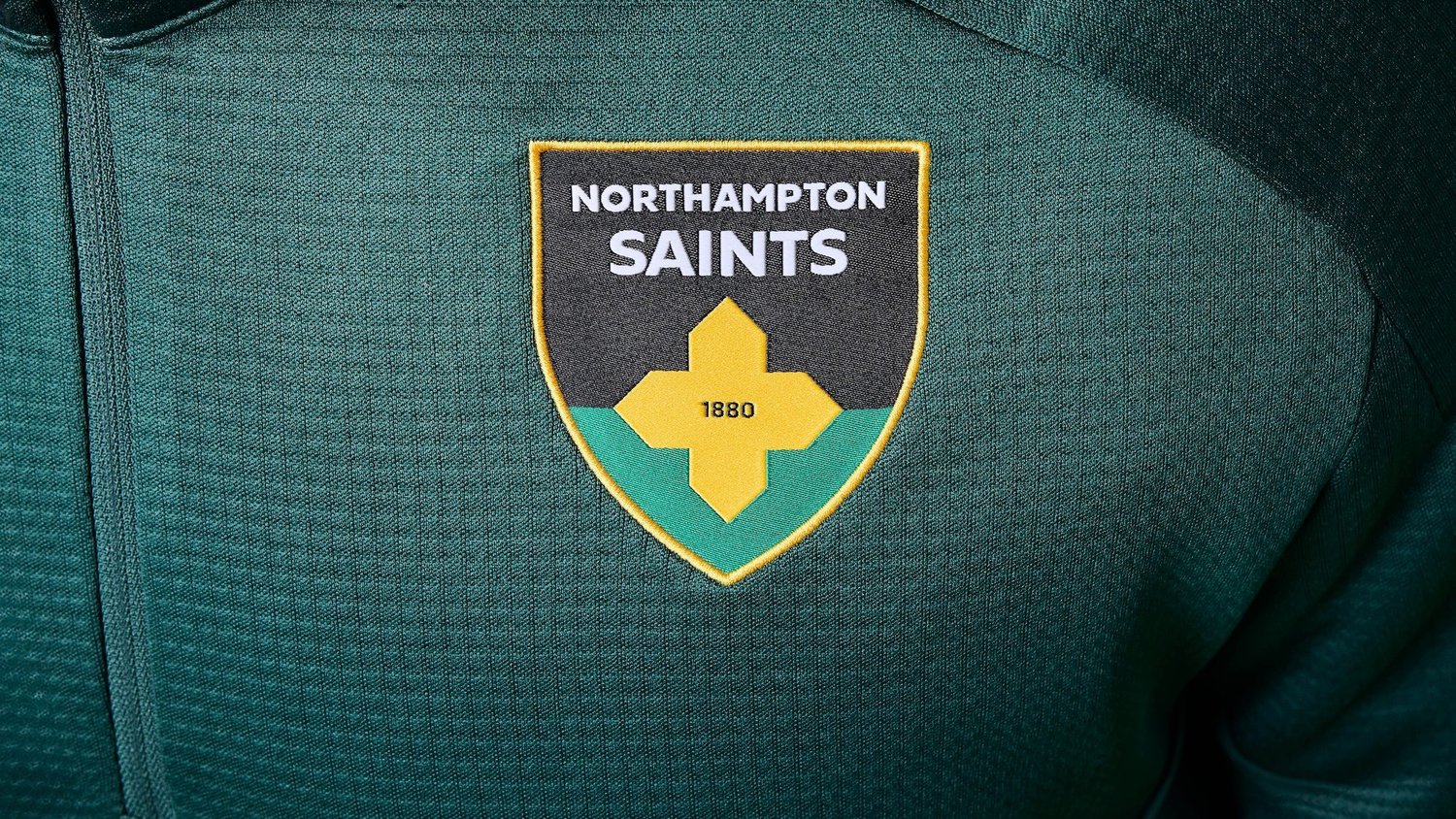
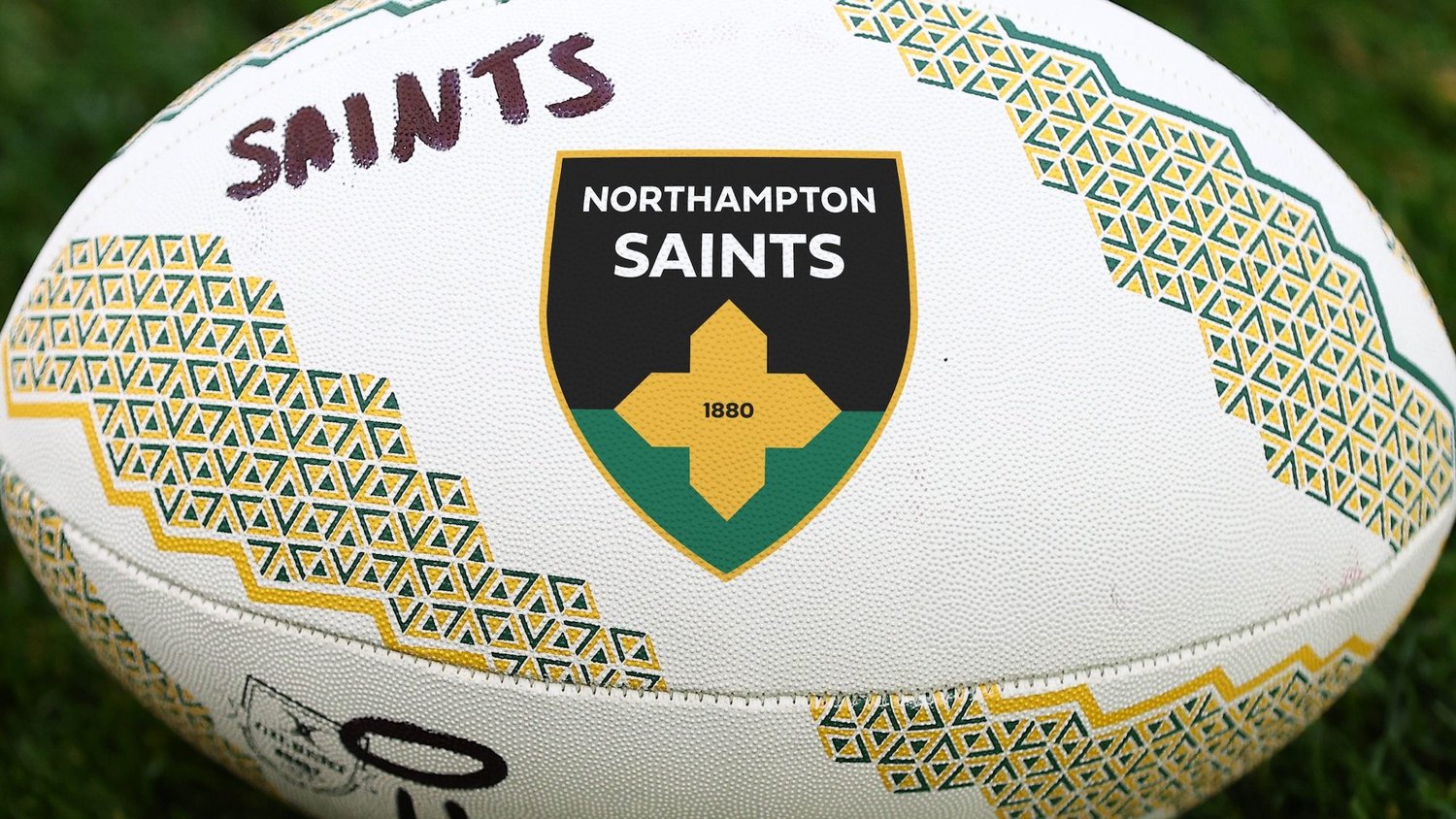
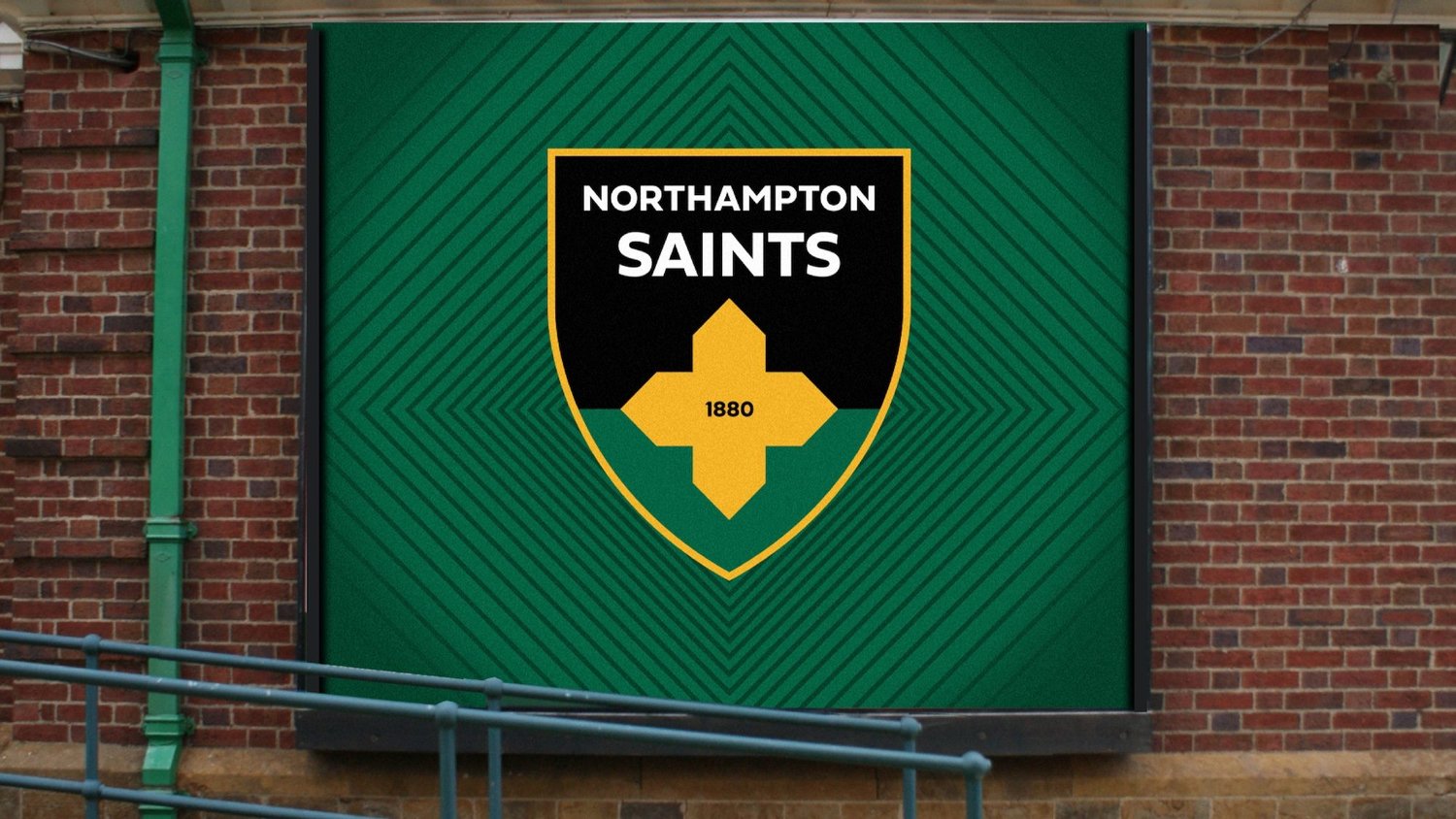
The below images place our new crest into real-life situations, allowing our supporters to see what the Club’s future will look like: